 Menu
Menu
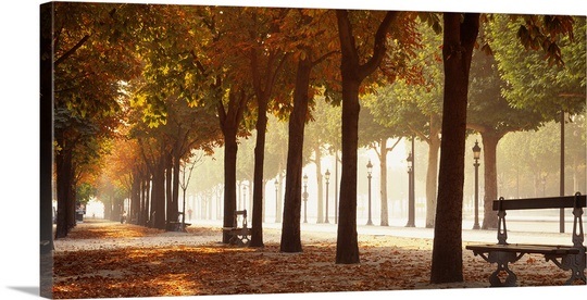
I want to split background image. For example original image like this
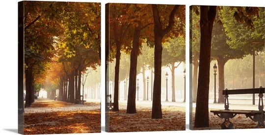
and I want an effect like this:
This is my code
<style>
    div{

    -webkit-transform: skewY(175deg);
    padding: 10px;
    margin: 10px;
    border: 10px;
    background-image: url(Chrysanthemum.jpg);
    width: 200px;
    height: 200px;
    background-origin: content-box;
    }
</style>
<div></div>
But I can't find any way how to split this background with the same thickness effect with CSS or jQuery.
 235
235
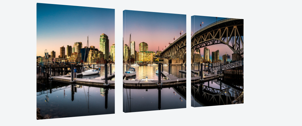
Here is a 3D approach to cut the image in 3 parts and make the thickness effect. It is responsive and relies on:
Demo of a 3d rotated and thick image.
Output:
body{perspective:1000px;}
.imgWrap{
  position:relative;
  width:90%;
  margin:5% auto;
  padding-bottom:39%;
  transform: rotateY(25deg);
  transform-style:preserve-3d;
}
.imgWrap > div{
  position:absolute;
  top:0;
  width:30.3%;height:100%;
  float:left;
  background-image:url('http://i.imgur.com/FhZxJJp.jpg');
  background-size:auto 100%;
  transform-style:preserve-3d;
  outline: 1px solid transparent; /* prevent jagged edges in firefox */
}
.imgWrap .left  { left: 0;     background-position:   3% 0; }
.imgWrap .center{ left:34.83%; background-position: -97% 0; }
.imgWrap .right { left:69.66%; background-position:-197% 0; }
.imgWrap > div:before{
  content:'';
  position:absolute;
  top:0;right:100%;
  width:10%; height:100%;
  background:inherit;
  transform-origin:100% 50%;
  transform:rotateY(-90deg);
}
.imgWrap .left:before  { background-position:     0%   0; }
.imgWrap .center:before{ background-position: -1001.3% 0; }
.imgWrap .right:before { background-position: -2001.4% 0; }
<div class="imgWrap">
<div class="left"></div>
<div class="center"></div>
<div class="right"></div>
</div>Note that you will need to add vendor prefixes for browser support. For more info, see canIuse.
168
This answer provides single element solutions only
A 2D solution would be to just use the pseudo elements :before and :after to imitate the gaps. You only need to position them and give them the proper distance to the border with calc().
To make it look more 3D, you can use transform perspective() in combination with rotateY() instead of skewY():
div {
  position: relative;
  -webkit-transform: perspective(1000px) rotateY(30deg);
  transform: perspective(1000px) rotateY(30deg);
  margin: 50px 10px;
  background-image: url(http://placekitten.com/g/600/200);
  width: 600px;
  height: 200px;
}
div:before,
div:after {
  content: "";
  position: absolute;
  top: 0;
  width: 10px;
  height: 100%;
  background: white;
}
div:before {
  left: calc(33% - 5px);
}
div:after {
  right: calc(33% - 5px);
}<div></div>To achieve a very simple 3D effect, you can add a border-left to the div and a border-right to the pseudo elements. With additionally applying a white top and bottom border and making the right border semi-transparent, the pseudo elements even give an 3D feeling. Unfortunately that is not possible with the main element. But here you can at least play around with the border transparency.
div {
  position: relative;
  -webkit-transform: perspective(1000px) rotateY(30deg);
  transform: perspective(1000px) rotateY(30deg);
  margin: 50px 10px;
  background-image: url(http://placekitten.com/g/600/200);
  width: 600px;
  height: 200px;
  background-origin: border-box;
  border-left: 5px solid rgba(0, 0, 0, 0.5);
}
div:before,
div:after {
  content: "";
  position: absolute;
  top: 0;
  width: 0;
  height: 100%;
  box-sizing: border-box;
  background: transparent;
  border-top: 4px solid white;
  border-bottom: 4px solid white;
  border-left: 10px solid white;
  border-right: 6px solid rgba(0, 0, 0, 0.5);
}
div:before {
  left: calc(33% - 7px);
}
div:after {
  right: calc(33% - 7px);
}<div></div>Here is another solution that rely on one element.
The idea is to use multiple background to create different layers above the intial image in order to:
Then we do a rotation with perspective in order to have the 3D illusion.
body {
  perspective: 1000px;
  max-width:600px;
}

.box {
  margin: 20px;
  width:400px;
  height:200px;
  border-left:20px solid transparent;
  transform: rotateY(25deg);
  transform-style: preserve-3d;
  background:
  /*
    1: The bottom shadow
    2: A small triangle at the bottom left corner for the 3D effect
    3: A small triangle at the top    left corner for the 3D effect
    4: The left side shadow
    5: White color to create the separation between each part
  */

  /* First part */
  /*1*/ linear-gradient(24deg,transparent 54%,#aaa 57%)          0px  100%/30px 16px border-box border-box,
  /*2*/ linear-gradient(to bottom left,transparent 50%,#fff 52%) 10px 100%/8px 3px,
  /*3*/ linear-gradient(to top left,transparent 50%,#fff 52%)    10px 0   /8px 3px,
  /*4*/ linear-gradient(rgba(0,0,0,0.5),rgba(0,0,0,0.5))         10px 0   /8px 100%,
  /*5*/ linear-gradient(#fff,#fff)                               0 0      /10px 100%,
  /* Second part */
  /*1*/ linear-gradient(30deg,transparent 35%,#aaa 51%)          130px 100%/10px 16px,
  /*2*/ linear-gradient(to bottom left,transparent 50%,#fff 52%) 140px 100%/8px  3px,
  /*3*/ linear-gradient(to top left,transparent 50%,#fff 52%)    140px 0   /8px  3px,
  /*4*/ linear-gradient(rgba(0,0,0,0.5),rgba(0,0,0,0.5))         140px 0   /8px  100%,
  /*5*/ linear-gradient(#fff,#fff)                               130px 0   /10px 100%,
  /* Third part */
  /*1*/ linear-gradient(30deg,transparent 35%,#aaa 51%)          260px 100%/10px 16px,
  /*2*/ linear-gradient(to bottom left,transparent 50%,#fff 52%) 270px 100%/8px  3px,
  /*3*/ linear-gradient(to top left,transparent 50%,#fff 52%)    270px 0   /8px  3px,
  /*4*/ linear-gradient(rgba(0,0,0,0.5),rgba(0,0,0,0.5))         270px 0   /8px  100%,
  /*5*/ linear-gradient(#fff,#fff)                               260px 0   /10px 100%,
  /* Main background */
  url(https://picsum.photos/400/200/?image=1015) 0 0/cover;
 background-repeat:no-repeat;
}
<div class="box" >
</div>
To better understand the puzzle use different colors for each gradient:
body {
  perspective: 1000px;
  max-width:600px;
}

.box {
  margin: 20px;
  width:400px;
  height:200px;
  border-left:20px solid transparent;
  transform: rotateY(25deg);
  transform-style: preserve-3d;
  background:
  /*
    1: The bottom shadow
    2: A small triangle at the bottom left corner for the 3D effect
    3: A small triangle at the top    left corner for the 3D effect
    4: The left side shadow
    5: White color to create the separation between each part
  */

  /* First part */
  /*1*/ linear-gradient(24deg,transparent 54%,red 57%)           0px  100%/30px 16px border-box border-box,
  /*2*/ linear-gradient(to bottom left,transparent 50%,blue 52%) 10px 100%/8px 3px,
  /*3*/ linear-gradient(to top left,transparent 50%,black 52%)   10px 0   /8px 3px,
  /*4*/ linear-gradient(pink,pink)                               10px 0   /8px 100%,
  /*5*/ linear-gradient(green,green)                             0 0      /10px 100%,
  /* Second part */
  /*1*/ linear-gradient(30deg,transparent 35%,red 51%)           130px 100%/10px 16px,
  /*2*/ linear-gradient(to bottom left,transparent 50%,blue 52%) 140px 100%/8px  3px,
  /*3*/ linear-gradient(to top left,transparent 50%,black 52%)   140px 0   /8px  3px,
  /*4*/ linear-gradient(pink,pink)                               140px 0   /8px  100%,
  /*5*/ linear-gradient(green,green)                             130px 0   /10px 100%,
  /* Third part */
  /*1*/ linear-gradient(30deg,transparent 35%,red 51%)           260px 100%/10px 16px,
  /*2*/ linear-gradient(to bottom left,transparent 50%,blue 52%) 270px 100%/8px  3px,
  /*3*/ linear-gradient(to top left,transparent 50%,black 52%)   270px 0   /8px  3px,
  /*4*/ linear-gradient(pink,pink)                               270px 0   /8px  100%,
  /*5*/ linear-gradient(green,green)                             260px 0   /10px 100%,
  /* Main background */
  url(https://picsum.photos/400/200/?image=1015) 0 0/cover;
 background-repeat:no-repeat;
}
<div class="box" >
</div>You can optimize the code using mask to have transparency:
body {
  perspective: 1000px;
  max-width:600px;
  background:linear-gradient(to right,pink,yellow);
}

.box {
  margin: 20px;
  width:400px;
  height:200px;
  border-left:30px solid transparent;
  transform: rotateY(25deg);
  transform-style: preserve-3d;
  background:
  /* */
  linear-gradient(30deg,transparent 65%,#aaa 67%)   0  100%/30px 16px border-box border-box,
  linear-gradient(rgba(0,0,0,0.5),rgba(0,0,0,0.5))  0 0   /8px 100%,
  /* */
  linear-gradient(30deg,transparent 35%,#aaa 51%)   130px 100%/10px 16px,
  linear-gradient(rgba(0,0,0,0.5),rgba(0,0,0,0.5))  140px 0   /8px  100%,
  linear-gradient(#fff,#fff)                        130px 0   /10px 100%,
  /* */
  linear-gradient(30deg,transparent 35%,#aaa 51%)   260px 100%/10px 16px,
  linear-gradient(rgba(0,0,0,0.5),rgba(0,0,0,0.5))  270px 0   /8px  100%,
  linear-gradient(#fff,#fff)                        260px 0   /10px 100%,

  url(https://picsum.photos/id/1015/400/200) center/cover;
 background-repeat:no-repeat;
  -webkit-mask:
     linear-gradient(30deg,transparent 35%,#fff 51%)  160px 100%/10px 16px,
     linear-gradient(30deg,transparent 35%,#aaa 51%)  290px 100%/10px 16px,

     linear-gradient(#fff,#fff) 0     50%/160px calc(100% - 16px),
     linear-gradient(147deg,transparent 21px,#fff 22px) 0 0/160px 8px,
     linear-gradient(30deg,transparent 19px,#fff 20px) 0 100%/160px 8px,

     linear-gradient(#fff,#fff) 170px 50%/120px calc(100% - 16px),
     linear-gradient(147deg,transparent 21px,#fff 22px) 140px 0/150px 8px,
     linear-gradient(30deg,transparent 19px,#fff 20px) 140px 100%/150px 8px,

     linear-gradient(#fff,#fff) 300px 50%/130px calc(100% - 16px),
     linear-gradient(147deg,transparent 21px,#fff 22px) 270px 0/160px 8px,
     linear-gradient(30deg,transparent 19px,#fff 20px) 270px 100%/160px 8px;
  mask:
     linear-gradient(30deg,transparent 35%,#fff 51%)  160px 100%/10px 16px,
     linear-gradient(30deg,transparent 35%,#aaa 51%)  290px 100%/10px 16px,

     linear-gradient(#fff,#fff) 0     50%/160px calc(100% - 16px),
     linear-gradient(147deg,transparent 21px,#fff 22px) 0 0/160px 8px,
     linear-gradient(30deg,transparent 19px,#fff 20px) 0 100%/160px 8px,

     linear-gradient(#fff,#fff) 170px 50%/120px calc(100% - 16px),
     linear-gradient(147deg,transparent 21px,#fff 22px) 140px 0/150px 8px,
     linear-gradient(30deg,transparent 19px,#fff 20px) 140px 100%/150px 8px,

     linear-gradient(#fff,#fff) 300px 50%/130px calc(100% - 16px),
     linear-gradient(147deg,transparent 21px,#fff 22px) 270px 0/160px 8px,
     linear-gradient(30deg,transparent 19px,#fff 20px) 270px 100%/160px 8px;
  -webkit-mask-repeat:no-repeat;
  mask-repeat:no-repeat;
}
<div class="box" >
</div>
2
If you love us? You can donate to us via Paypal or buy me a coffee so we can maintain and grow! Thank you!
Donate Us With