 Menu
Menu
I want to create shape like on this picture:
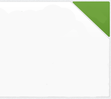
I created triangle shape like on this pic, and set the margins to be in top right angle, but I don't know how to make it look divided from the left div like shown on picture.
Do I have to "cut" left div to remain its grey border and to look divided from green triangle?
Is there any idea how to do this?
EDIT:
position:absolute, navigation bar goes behind div. 386
386
You can achieve that effect with a combination of border-radius and transform: skew() on your triangle element. With skewing the element, the border radius effect remains on the corner. Here is a working single element example.
I'd suggest, given the following mark-up:
#box { width: 10em; height: 6em; border: 4px solid #ccc; background-color: #fff; position: relative; } #box::before, #box::after { content: ''; position: absolute; top: 0; right: 0; border-color: transparent; border-style: solid; } #box::before { border-width: 1.5em; border-right-color: #ccc; border-top-color: #ccc; } #box::after { border-radius: 0.4em; border-width: 1.35em; border-right-color: #0c0; border-top-color: #0c0; }<div id="box"></div>If you love us? You can donate to us via Paypal or buy me a coffee so we can maintain and grow! Thank you!
Donate Us With

