 Menu
Menu
I am using android design library's TextinputLayout. But couldn't customize the hint color, label color and the underline color of EditText inside TextinputLayout. Please help.
 558
558
To change the bottom line color you have to use the attribute: boxStrokeColor .
<item name="colorControlNormal">#c5c5c5</item>
<item name="colorControlActivated">@color/accent</item>
<item name="colorControlHighlight">@color/accent</item>
For more info check this thread.
<style name="MyHintStyle" parent="@android:style/TextAppearance">
    <item name="android:textColor">@color/main_color</item>
</style>
and use it like this:
<android.support.design.widget.TextInputLayout
    ...
    app:hintTextAppearance="@style/MyHintStyle">
<android.support.design.widget.TextInputLayout
    ...
    app:hintTextAppearance="@style/MyHintStyle"
    android:textColorHint="#c1c2c4">
Thanks to @AlbAtNf
278
With the Material Components Library you can use the com.google.android.material.textfield.TextInputLayout.
You can apply a custom style to change the colors.
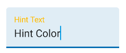
To change the hint color you have to use these attributes:hintTextColor and android:textColorHint.
<style name="Custom_textinputlayout_filledbox" parent="@style/Widget.MaterialComponents.TextInputLayout.FilledBox">
    <!-- The color of the label when it is collapsed and the text field is active -->
    <item name="hintTextColor">?attr/colorPrimary</item>

    <!-- The color of the label in all other text field states (such as resting and disabled) -->
    <item name="android:textColorHint">@color/selector_hint_text_color</item>
</style>
You should use a selector for the android:textColorHint. Something like:
<selector xmlns:android="http://schemas.android.com/apk/res/android">
  <item android:alpha="0.38" android:color="?attr/colorOnSurface" android:state_enabled="false"/>
  <item android:alpha="0.6" android:color="?attr/colorOnSurface"/>
</selector>
To change the bottom line color you have to use the attribute: boxStrokeColor.
<style name="Custom_textinputlayout_filledbox" parent="@style/Widget.MaterialComponents.TextInputLayout.FilledBox">
    ....
    <item name="boxStrokeColor">@color/selector_stroke_color</item>
</style>
Also in this case you should use a selector. Something like:
<selector xmlns:android="http://schemas.android.com/apk/res/android">
  <item android:color="?attr/colorPrimary" android:state_focused="true"/>
  <item android:alpha="0.87" android:color="?attr/colorOnSurface" android:state_hovered="true"/>
  <item android:alpha="0.12" android:color="?attr/colorOnSurface" android:state_enabled="false"/>
  <item android:alpha="0.38" android:color="?attr/colorOnSurface"/>
</selector>
You can also apply these attributes in your layout:
<com.google.android.material.textfield.TextInputLayout
    style="@style/Widget.MaterialComponents.TextInputLayout.FilledBox"
    app:boxStrokeColor="@color/selector_stroke_color"
    app:hintTextColor="?attr/colorPrimary"
    android:textColorHint="@color/selector_hint_text_color"
    ...>
If you love us? You can donate to us via Paypal or buy me a coffee so we can maintain and grow! Thank you!
Donate Us With

