 Menu
Menu
I have read a lot of posts about this but I still didn't find an answer. I have a footer that I want to be at the end of the page, not fixed. The problem is that the footer is where the content ends. Look at picture. 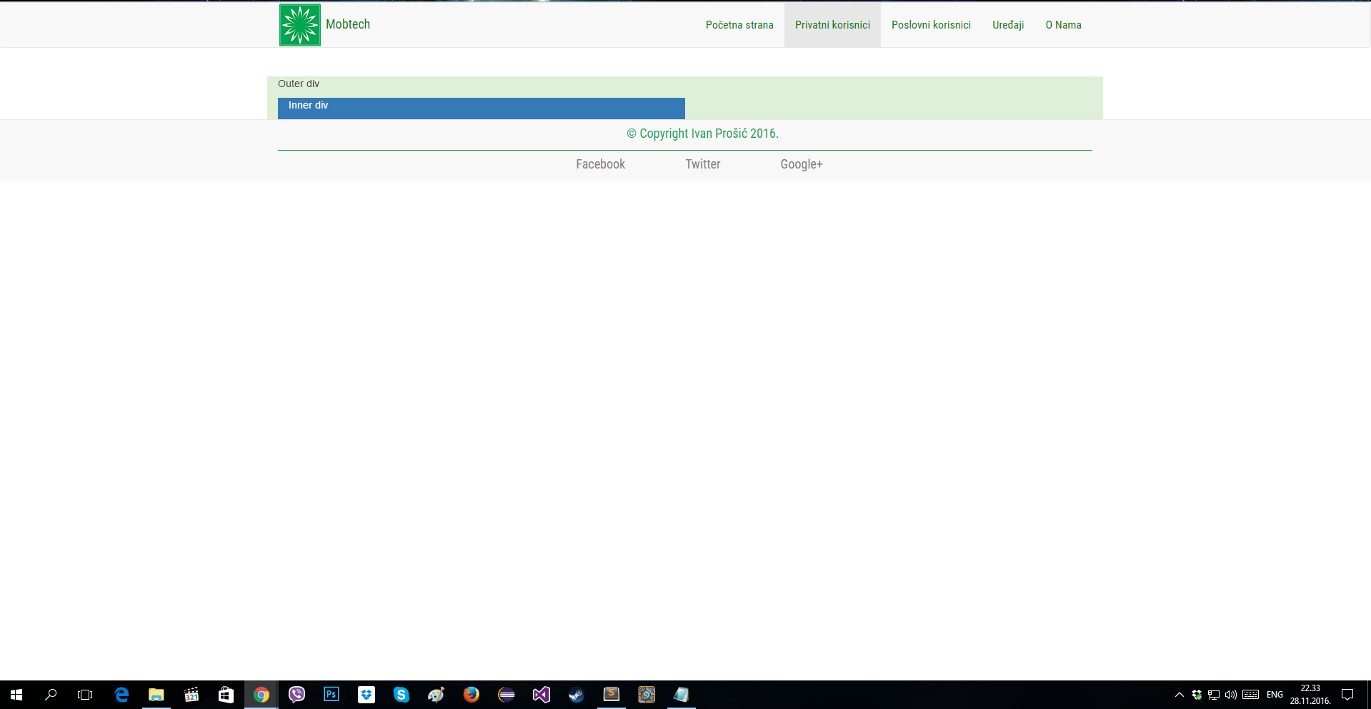
This is my HTML:
<!DOCTYPE html> <html> <head> <meta charset="utf-8"/> <title> Mobtech - Privatni korisnici </title> <!--Ubaci bootstrap css --> <link rel="stylesheet" href="css/bootstrap.min.css"> <link rel="stylesheet" href="css/style.css"> <link rel="css/basic-template.css" rel="stylesheet"> <link href="https://fonts.googleapis.com/css?family=Roboto+Condensed" rel="stylesheet"> </head> <body> <!--Navigation bar --> <nav class="navbar navbar-default" role="navigation"> <div class="container"> <div class="navbar-header"> <button type="button" class="navbar-toggle" data-toggle="collapse" data-target="#navbar-container"> <span class="sr-only"> Pokazi i sakrij navigaciju </span> <span class="icon-bar"></span> <span class="icon-bar"></span> <span class="icon-bar"></span> </button> <a class="navbar-brand" href="#"> <span> <img src="Slike/logo.png" alt="LogoSlika"/> </span> <font face="Roboto Condensed" size="4" color="green"> Mobtech </font> </a> </div> <div class="collapse navbar-collapse" id="navbar-container"> <ul class="nav navbar-nav navbar-right"> <li><a href="index.html"> Početna strana </a> </li> <li class="active"><a href="#"> Privatni korisnici </a> </li> <li><a href="poslovni.html"> Poslovni korisnici </a> </li> <li><a href="uredjaji.html"> Uređaji </a> </li> <li><a href="onama.html"> O Nama </a> </li> </ul> </div> </div> </nav> <br /> <div class="container"> <!--Container --> <div class="row"> <!-- Kolona na velikom ekranu (lg) prikazuje duzinu jedne kolone, Ekstra small (xs) prikazuje 4 kolone --> <div class="col-lg-12 bg-success"> <p> Outer div </p> <div class="col-lg-6 bg-primary"> <p> Inner div </p> </div> </div> </div> </div> <!-- Footer --> <footer class="mojFooter"> <font face="Roboto Condensed" size="4"> <center> <div class="container"> <div class="row" style="margin-top: 7px;"> <p> © Copyright Ivan Prošić 2016.</p> </div> <div class="bottom-footer"> <div class="col-md-12"> <ul class="footer-nav"> <li> <a href="https://www.facebook.com/"> Facebook </a> </li> <li> <a href="https://twitter.com/"> Twitter </a> </li> <li> <a href="https://plus.google.com/"> Google+ </a> </li> </ul> </div> </div> </div> </font> </center> </footer> <!-- JavaScript fajl --> <script src="js/jquery.min.js"></script> <!-- Kompresovan JavaScript fajl --> <script src="js/bootstrap.min.js"></script> </body> </html> This is my CSS, for the footer only:
.mojFooter{ background-color: #f8f8f8; color: #00a651; padding-top: 0px; border-top: 1px solid #e7e7e7; margin-bottom: 0px; } .bottom-footer{ border-top: 1px solid #00a651; margin-top: 0px; padding-top: 7px; color: #00a651; } .footer-nav li{ display: inline; padding: 0px 40px; } .footer-nav a{ color: grey; text-decoration: none; }  466
466
You can use "min-height: 80vh;". This allows you to set the minimum height, using the viewport height.
When using bootstrap 4 or 5, flexbox could be used to achieve desired effect:
<body class="d-flex flex-column min-vh-100"> <header>HEADER</header> <content>CONTENT</content> <footer class="mt-auto"></footer> </body> Please check the examples: Bootstrap 4 Bootstrap 5
In bootstrap 3 and without use of bootstrap. The simplest and cross browser solution for this problem is to set a minimal height for body object. And then set absolute position for the footer with bottom: 0 rule.
body { min-height: 100vh; position: relative; margin: 0; padding-bottom: 100px; //height of the footer box-sizing: border-box; } footer { position: absolute; bottom: 0; height: 100px; } Please check this example: Bootstrap 3
118
In my case for Bootstrap4:
<body class="d-flex flex-column min-vh-100"> <div class="wrapper flex-grow-1"></div> <footer></footer> </body> If you love us? You can donate to us via Paypal or buy me a coffee so we can maintain and grow! Thank you!
Donate Us With

