 Menu
Menu
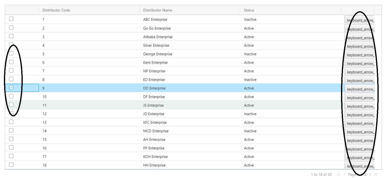
In each row of my ag-grid. I need to add angular material icon button in each row of ag-grid. However, the outcome only shown me text button. It does not display me icon button in my ag-grid.
Next, I need to have multi selection checkbox in my ag-grid. However, in my ag-grid only able to select one row only. How can I achieve for multi selection row in ag-grid listing.
The following is my source code.
  constructor() {
      this.gridOptions = <GridOptions>{
          paginationPageSize: 18,
          animateRows: true,
    };
      this.gridOptions.columnDefs = [
        {
            field: "",
            width: 110,
            checkboxSelection: true
        },
        {
            headerName: "Distributor Code",
            field: "dist_code",
            width: 330,
            sortingOrder: ["asc", "desc"]
        },
        {
            headerName: "Distributor Name",
            field: "dist_name",
            width: 330,
            sortingOrder: ["asc", "desc"]
        },
        {
            headerName: "Status",
            field: "status",
            width: 330,
            sortingOrder: ["asc", "desc"],

        },
        {
            field: "",
            width: 110,
            cellRenderer: function clickNextRendererFunc(){
                    return '<button mat-stroked-button><mat-icon>keyboard_arrow_right</mat-icon></button>';
            }
        }
    ];
    this.gridOptions.rowData = [
        {dist_code: 1, dist_name: "ABC Enterprise", status: "Inactive"},
        {dist_code: 2, dist_name: "Go Go Enterprise", status: "Active"},
        {dist_code: 3, dist_name: "Alibaba Enterprise", status: "Active"},
        {dist_code: 4, dist_name: "Silver Enterprise", status: "Active"},
        {dist_code: 5, dist_name: "George Enterprise", status: "Inactive"},
        {dist_code: 6, dist_name: "Kent Enterprise", status: "Active"},
        {dist_code: 7, dist_name: "NP Enterprise", status: "Active"},
        {dist_code: 8, dist_name: "ED Enterprise", status: "Inactive"},
        {dist_code: 9, dist_name: "DD Enterprise", status: "Active"},
        {dist_code: 10, dist_name: "DF Enterprise", status: "Active"},
        {dist_code: 11, dist_name: "JS Enterprise", status: "Active"},
        {dist_code: 12, dist_name: "JD Enterprise", status: "Inactive"},
        {dist_code: 13, dist_name: "KFC Enterprise", status: "Active"},
        {dist_code: 14, dist_name: "MCD Enterprise", status: "Inactive"},
        {dist_code: 15, dist_name: "AH Enterprise", status: "Active"},
        {dist_code: 16, dist_name: "PP Enterprise", status: "Active"},
        {dist_code: 17, dist_name: "KOH Enterprise", status: "Active"},
        {dist_code: 18, dist_name: "HH Enterprise", status: "Active"},
        {dist_code: 19, dist_name: "GG Enterprise", status: "Inactive"},
        {dist_code: 20, dist_name: "PP2 Enterprise", status: "Active"}
    ]

    }
The following is my print screen
 828
828
This question is having 3 parts.
1. Enable multi-selection:
You need to have this attribute on ag-grid-angular element: rowSelection="multiple"
2. Enable selection checkbox:
Keep checkboxSelection: true for the first ColDef, which you are already doing.
3. Add angular material icon button in each row
You need to use cellRenderer and return html string for this.
cellRenderer: (data) => {
    return `<mat-icon class="mat-icon material-icons mat-icon-no-color" role="img" aria-hidden="true">
       home</mat-icon>`;
}
Since
cellRendererexpects html string in return, you should not simply provide<mat-icon>home</mat-icon>as it won't get compiled.
146
You are currently using the string as rendered, what you need is a component or you can use the custom class which handles it like this. but, as you want to render the material component you will still have to compile the materialbutton.
I would suggest you to use the cellRendererFramework and use the custom component,
Create custom component called RedComponentComponent and render it like this.
cellRendererFramework: RedComponentComponent,//your custom component
So, your cell will look like this
      {
        headerName: "Value",
        field: "value",
        cellRendererFramework: RedComponentComponent,
        width: 100
      },
And this component will have your button code, and it will be responsible for your rendering.
I forked their demo and it is here you can take a look.
37
If you love us? You can donate to us via Paypal or buy me a coffee so we can maintain and grow! Thank you!
Donate Us With