 Menu
Menu
Ok, so I have a mobile application with Cordova and AngularJS. For the styling I use Less and Bootstrap.
Problem
In the mobile app I have tried to size my divs with percentage (%). But this does not seem to work. I cannot seem to change the following behavior: The divs are as big as the content inside of them. This problem sounds quite easy and I have tried many options on here (stackoverflow) aswell as on the web. Yet I have not found the solution to fix it and it is getting quite annoying.
I have tried
Adding html, body { height: 100% },
Adding html, body, #canvas { height: 100%}
Adding #canvas { min-height: 100% }
Adding html { height: 100% } body { min-height: 100% }
And a lot of other variations. Using px works, but I don't know how big my mobile device is, so that isn't realy handy.. (I also use bootstrap and some media queries for styling).
Example
When I add elements to my div I get the following behavior:
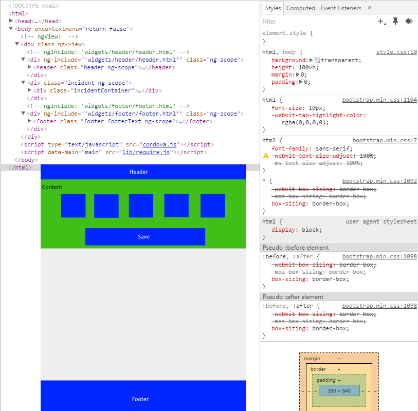
I want to remove that white empty space, but I can only achieve that when using px instead of %.
Less example:
html, body {
    background: transparent;
    height: 100%;
    margin: 0;
    padding: 0;
}

#canvas {
    min-height: 100%;
}

body {
    -webkit-touch-callout: none;                 //prevent callout to copy image, etc when tap to hold
    -webkit-text-size-adjust: none;              //prevent webkit from resizing text to fit
    -webkit-user-select: node;                   //prevent copy paste, to allow, change 'none' to 'text'
    min-height: 100%;
    margin: 0;
    padding: 0;
    background-color: @cgiColor;
}

.header {
    top: 0px;
    width: 100%;
    height: 5%;
    background: @companyColor;
    color: @textColor;
}

.incidentContainer {
    background: @appBodyColor;
    width: 100%;
    height: 70%;
}

.footer {
    position: absolute;
    color: @textColor;
    bottom: 0px;
    height: 15%;
    width: 100%;
    background: @companyColor;
}
Extra information
I am using AngularJS, so my application is a single page application. My index.html looks as follows:
<body oncontextmenu="return false" >
   <div class="{{ pageClass}}"  ng-view ></div>
   <script type="text/javascript" src="cordova.js"></script>
   <script data-main="main" src="lib/require.js"></script>
</body>
With of course the standard links to my CSS sheets, and so on. All the other pages are includes in the 'ng-view' and don't have any or tags. This because they are included.
Solution
The solution was to add the following CSS rule:
div[ng-view]{
     height: 100%;
}
This worked, because all divs (except for html & body) are children of this item. Adding the 100% made the div space span to 100% of the screen and thus provides a space for percentage to work.
Credits go to Jai for this answer!
 473
473
Height % is based on it's parent (so you have to set every element above the target element to 100%) , there are a few workarounds to this though. For instance you can set it to height: 100vh; This will create the element to be 100% of your window height. Or you can use px instead.
Syntax: To set a div element height to 100% of the browser window, it can simply use the following property of CSS: height:100vh; Example: HTML.
To size the <iframe> , we ignore the width="560" height="315" element properties, and instead use the CSS properties width:100%;height:100%; . That's it: a full-width <iframe> with fixed aspect ratio.
Why does 100vh Issue Happen on Mobile Devices? I investigated this issue a bit and found out the reason. The short answer is that the browser's toolbar height is not taken into account. If you want to go deep on why this happens, I found this Stack Overflow thread very helpful.
Have you tried to add the following css and set Important attribute
html, body { height: 100% !important }
If you love us? You can donate to us via Paypal or buy me a coffee so we can maintain and grow! Thank you!
Donate Us With