 Menu
Menu
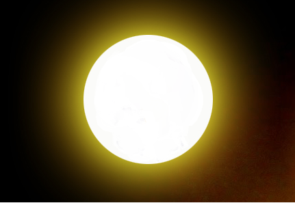
i am trying to create a moon with light glow. same as in images.
i have tried but not much successful.
I don't wants to use image in website. i wants to create only this with CSS3.
My circle is creating very small and also glow is in small area . i want glow in large radius area
http://jsfiddle.net/naresh_kumar/ezUfG/6/
Html
<div>
    <span>Glow</span>
</div>
Css
div {
    margin: 20px 10px 10px;
    text-align: center;
    font-family: sans-serif;
}

span {
    display: inline-block;
    padding-top: 40px;
    background: whiteSmoke;
    width: 100px;
    height: 60px;
    text-align: center;
    vertical-align: middle;

    -webkit-box-shadow: 0 0 10px #F8A50E;
       -moz-box-shadow: 0 0 10px #F8A50E;
            box-shadow: 0 0 10px #F8A50E;

    -webkit-border-radius: 50px;
       -moz-border-radius: 50px;
            border-radius: 50px;

    -webkit-transition: box-shadow .4s ease;
       -moz-transition: box-shadow .4s ease;
        -ms-transition: box-shadow .4s ease;
         -o-transition: box-shadow .4s ease;
            transition: box-shadow .4s ease;
}

span:hover {
    -webkit-box-shadow: 0 0 10px red;
       -moz-box-shadow: 0 0 10px red;
            box-shadow: 0 0 0 10px red;
}
 728
728
use box-shadow :)
This example uses two comma separated shadows:
box-shadow:0 0 50px gold,0 0 150px gold;
http://codepen.io/gcyrillus/pen/qdcos
You could draw it with radial-gradient too. Result will varie from browser to browser.
59
I believe this is what you want:
span:hover {
    -webkit-border-radius: 70px;
    -moz-border-radius: 70px;
    border-radius: 70px;
    -webkit-box-shadow:0px 0px 10px red;
    -moz-box-shadow: 0px 0px 10px red;
    box-shadow: 0px 0px 10px red;
}
Demo: http://jsfiddle.net/ezUfG/10/
33
Instead of this style for your box-shadow:
box-shadow: 0 0 0 10px red;
Try this:
box-shadow: 0 0 10px red;
Edit: If you want the glow to be bigger, just increase the radius:
box-shadow: 0 0 30px red;
jsFiddle here
45
If you love us? You can donate to us via Paypal or buy me a coffee so we can maintain and grow! Thank you!
Donate Us With